
Adopt A Star
is a non profit organization dedicated to raising funds for the Kepler/TESS Asteroseismic Science Consortium, a group of astronomers studying Earth-like planets and their stars.
It should be noted that this project was accompanied by a six-month user experience design training, followed by a fixed course plan and a planned digital implementation. It helped me deepen my knowledge in user experience design, explore approaches to digitization of school lessons, and understand how impulses for modern learning can be set in accordance with the sustainability goals.
Role: Researcher, Prototyping & Usability Testing; Team project TimeBox: 2 weeks: April 29, 2020 - May 13, 2020
Tools: Figma, Photoshop, Miro, Trello, Pixton
Design Challenge
The organization's website needs to be redesigned to better connect with its users, including building a more descriptive information architecture, designing a visually engaging user interface, and developing a coherent visual language.
Users testing the website had difficulty locating and deciphering the mission statement, leading to a lack of motivation for donating to the cause. The descriptions of the star options are perplexing for average users that want to know the distinction between the choices. Not only does the process of adopting a star lack clear instructions and descriptions, but the visual layout also adds more challenges for readability; it does not provide adequate feedback for the required fields.
The present website :

Design Opportunity
Our goal is to redesign a visually engaging interface with intriguing information that's easy to grasp. Our vision is to create an effortless process that provides incentive by piquing the interest of those who are unfamiliar with astronomy. Our success can be defined by an increase in donations from new users and a rise in recurring contributions.
The Solution
Our solution is a redesigned website consisting of a rich, animated space and color theme with relatable images. We organized and improved the visibility of information architecture such as the “Mission Statement” and “FAQs” on the website. In addition, we added user friendly interactions to assist users in making choices based on their interests and newly designed “Certificates.” Overall, we made a pleasant and fun experience for the user.
Enhanced Features
Content
A lot of research has went into providing the user with relevant, engaging content and in order to keep their interest. The main purpose has been redefined to be more simple and powerful, highlighting the important points for common users to understand.
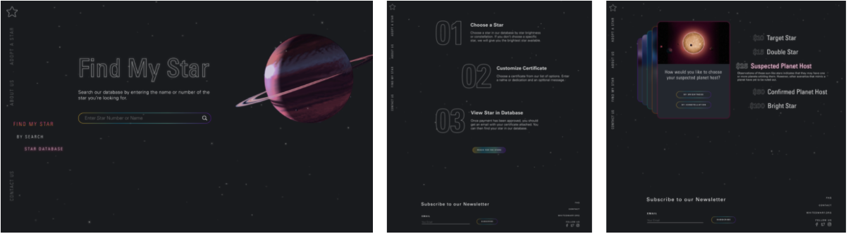
Choose a Star
“Choose a Star” page has been redesigned with with better organized information and animations . Users can now search for a star based on constellation or brightness.
FAQs
Added the “FAQs” section with animations for the users to understand the purpose and process of the website. Users can find answers to various questions to gain knowledge about the different types of stars.
Certificates
New colorful certificates have been designed to give the users more aesthetic options to choose from.
Research
As an initial step we have interviewed 5 users who were in their mid 20s to early 30s and did user testing on the existing website to understand any issues and analyze the scope for improvement. We prepared a interview test plan and collected the data.
Goals & Objectives:
Our goal was to identify the hurdles that users experience while navigating through adoptastar.org and alleviate them.
How easily can users navigate the website?
How do users feel about the overall UI?
How easy or difficult it is for users to go through the transaction process?
Does the user understand the purpose of the website?
Sample Interview
How do you feel about the UI?
Very old school. Looks very commercial. Feels like it is from the 1990’s due to the fonts and colors. The drop down menus are poorly designed with small font that older people can’t read. Certain icons aren’t clear.
If you were to adopt a star, in what situation would you do it?
Maybe in the memory of someone.
Do you know what a suspected planet host is?
Yes.
What do you like about this website?
It’s a cool way to fund research. It’s not well presented but after knowing the purpose of the website, I think I would still use it.
What do you dislike about this website?
The colors and presentation of the content can be much better. The purpose of the fund is hidden. There should be more content on the recent research and findings to create more user interest. You can educate users more about which research labs and projects these funds go toward . Users can be given options to choose which research projects their funds can be used for.
Research Analysis
Based on user interviews and insights, we have created an affinity map . Surprisingly, people are interested to support and engage with the organization even though they didn’t understand a lot of details.
With the collected data the following are the prioritized issues
Mission statement and cause is not clear
User Interface is not very user-friendly and does not looks like a genuine website
Content, especially regarding the various stars, is very confusing
Developed an empathy map based on how the user says, does, feels, and thinks.
Heuristic Analysis and Competitive Analysis
We did user heuristic evaluation of the website to understand users’ content accessibility issues. Also, done competitive analysis with two similar non-profit organization websites.
Ideation
Storyboard
A common scenario which anybody can relate to: A gift for a loved one!
Persona
This was the project that I worked on during the month of mother’s day. Inspired by the special day, I created the following persona.
Information Architecture
As a part of this project, I did a lot of research on space research organizations and their programs in order to add more information to the website and give the user more insights. In the process, I developed an interest in space theory and astronomy.
Prototype
The task flow is a linear process and plans out how the user will navigate the site.
Initial Wireframes
Each one of us came up with individual design ideas of the home page. After a series of discussions and exchange of ideas, our final prototype was finished.
UI Style Guide
Came up with a style guide for the high-fidelity wireframes which includes:
Logos
Color Palette
Typography (H1-H6 & Body Copy)
Iconography
Imagery
Responsive Header & Footer Navigation Component
Button states
Animations
Hi-Fi clickable Prototype

A clickable prototype of “Adopt A Star” application
Key Learnings
I gained experience with more advanced prototyping tools. Due to the aggressive deadline and Figma’s limited capabilities, we were unable to implement a lot of the stuff that we had learned. This is because we didn’t have enough time to learn new tools and create rich animations that run smoothly. With more time, it could’ve be more cohesive, but I’m still proud of this nonetheless. Overall, it was very fun experience working with bright color schemes and engaging animations.
Thanks for reading!


